By the early twentieth century, colour lithography had grown into a flexible and versatile medium. Technical innovations in the lithographic process, such as the rub-down shading medium, the mechanical stippling pen and the aerograph or air-brush, facilitated the production of subtle modulations in texture, colour and tone. Meanwhile, a growing class of professional printers offered artists and designers unprecedented access to technical expertise.
And yet, lithography, like most chromatic print media, remained beholden to a constricting principle which no amount of technical innovation could budge: layers. In lithography, each colour must be mapped out on its own stone, and then these individual sections have to be painstakingly superimposed, or “aligned,” into a complete image. Accordingly, not only is the complexity of an image broadly determined by the number of layers one can afford to produce, but passages that would be easy or even incidental in a painting – a brush mark, a splash of paint, the blending of two colours – must be rigorously planned out in advance, such that the correct part of the correct layer ends up on top. Any number of pictorial effects can be achieved, but they have to be stage-managed to a degree absent in other media. The result may be virtuosic, but it is never casual or easy.
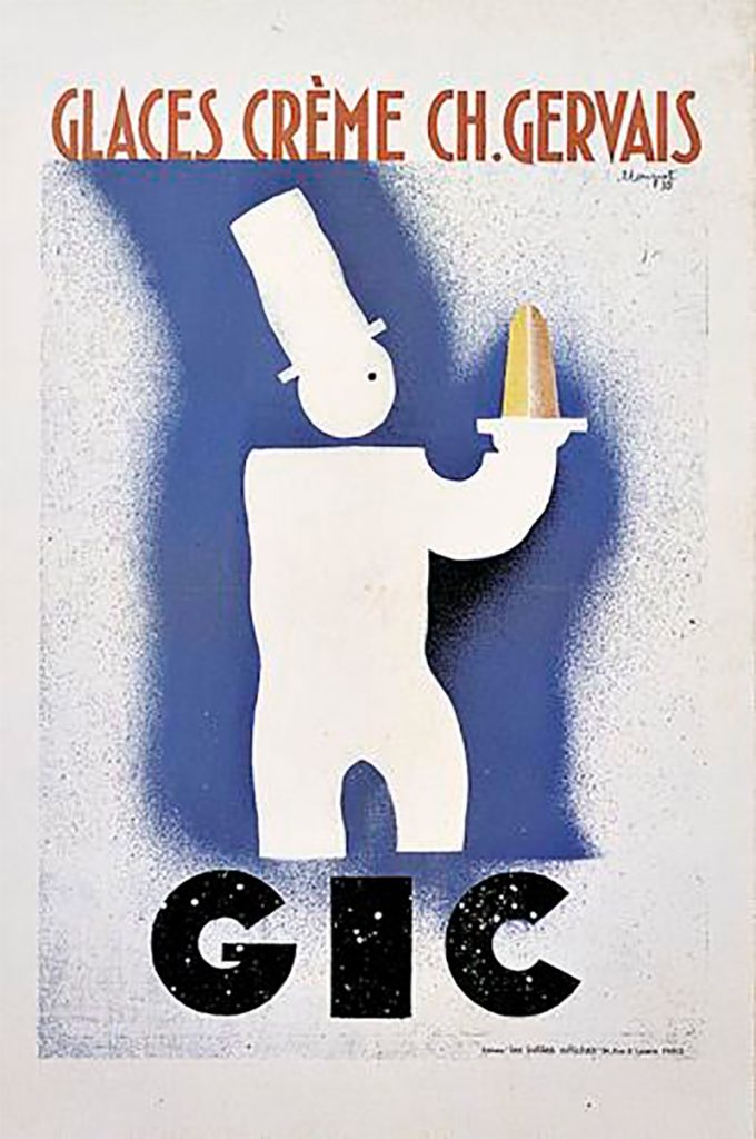
Loupot’s 1930 GIC ice cream poster plays with this idea in a particularly delightful way. The splatter of white which overlays the brand name (evoking both melting ice-cream and gestural flicks of paint) constitutes a sly, process-based wink. The intimation is of a mistake: as if Loupot’s spray-gun or paint brush had strayed onto the type. The reality, of course, is that each of the two components – spray and type – would have been devised and printed separately. The white splatter is a distinct covering layer, a carefully contrived “accident”. It reveals Loupot’s “hand” while emphasising, to those in the know, its absence.