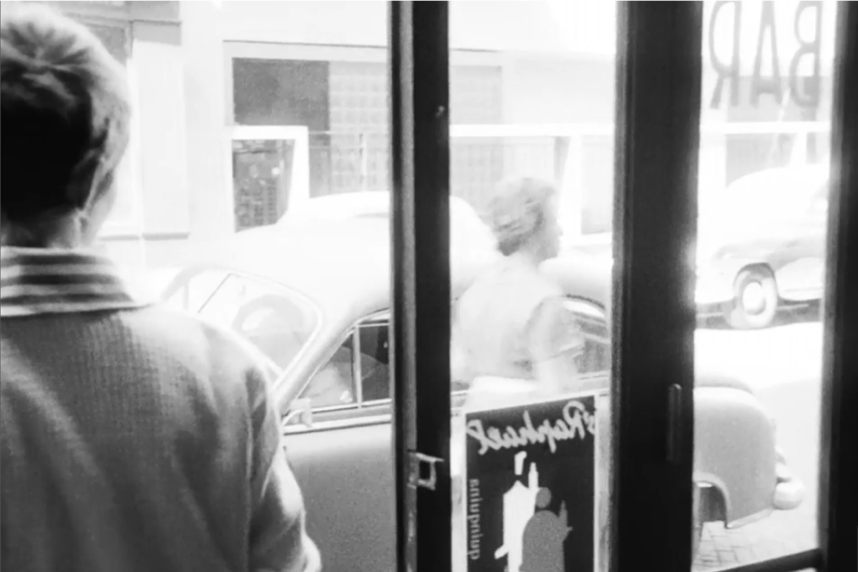
Patriciahas just betrayed her petty criminal lover Michelto the police.She puts down the receiver and walks out into the street. As she opens the door, a small poster is visible in the right hand window. It is Loupot’s design for the aperitif brand Saint-Raphaël, two waiters in red and white, each holding up a bottle.

This innocuous moment tells us much about the nature of the poster. Quietly sitting off-frame in Jean-Luc Godard’s Nouvelle Vague masterpiece, it is embedded into the everyday fabric of the scene. It has not been purposefully inserted there by the director, nor does it tell us anything about the narrative moment (here the dramatic denouement). But the inclusion locates the scene in a time and a geography, its obliqueness taking us neatly into the world where the still image was omnipresent and all-encompassing. Ever since the renovations of Baron Haussmann in the 1850s, writers have played on the idea of Paris as a place of pure spectacle. The city was gutted, newly beautified, and aestheticized – designed to be looked at. An 1881 law had permitted freedom of poster advertising. The walls of Paris proclaimed the new, the vibrant, and the luxurious.
Is the function of the poster simply to sell ? Not straightforwardly so, it seems. In the 1920s a series of articles run in one of the leading magazine of the time, Vendre, questioned whether advertising through posters had any clear economic benefits. Why choose the poster? In the personnages– the corpulent, pacing waiters of Saint-Raphaël, the mischievous Cointreau clown, the flummoxed Nectar for Nicolas – advertising becomes the most charming sort of trickery. These figures run in and out of our imagination, breathless, stuttering. They watch us from walls, become part of the dreamscape of the city. Perhaps we might even like to speak of a poetics of advertising, then.